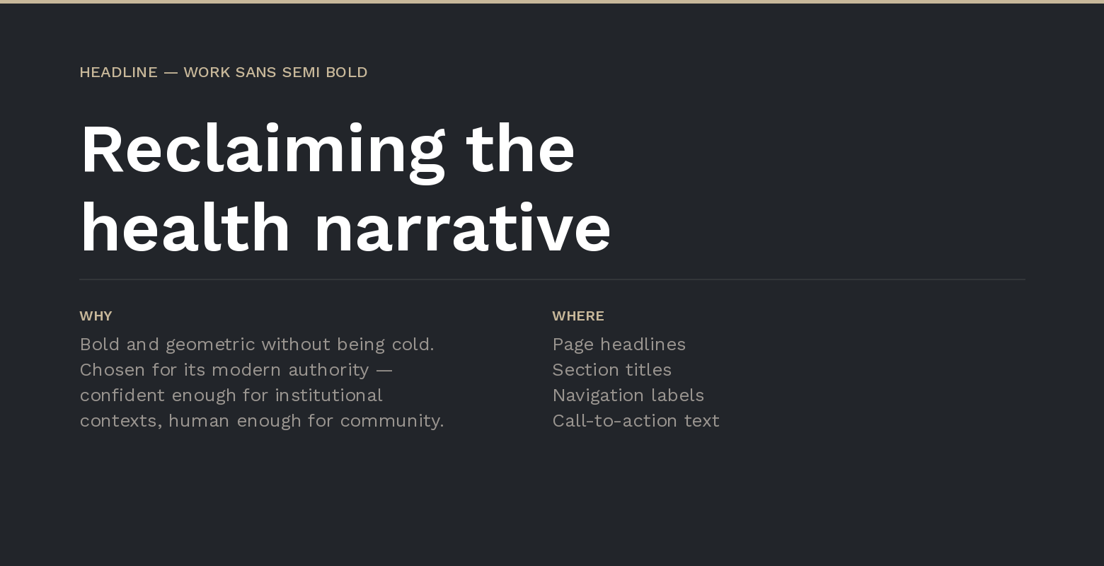
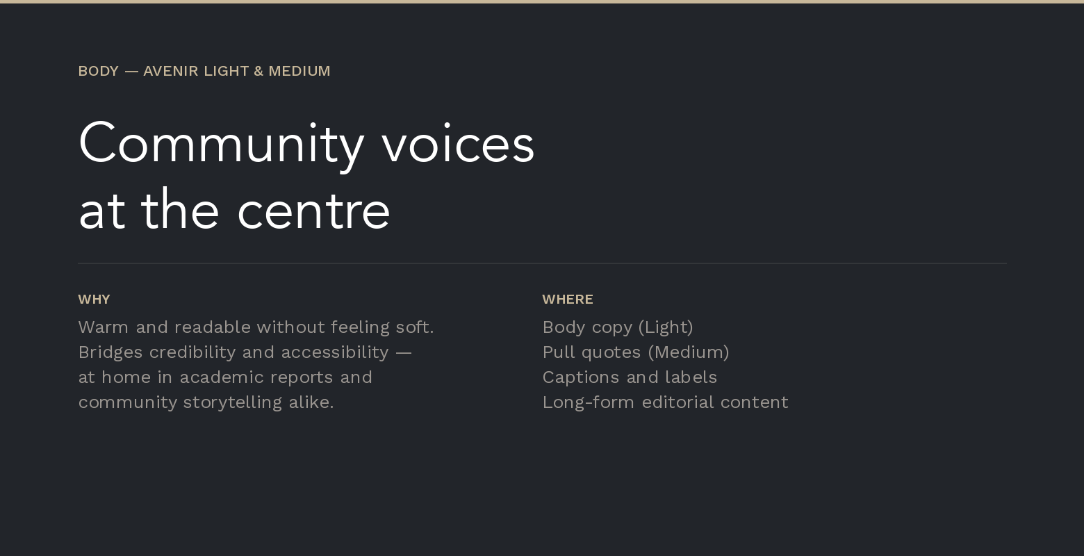
Typography
Brand Identity & Digital
A brand system for global health storytelling
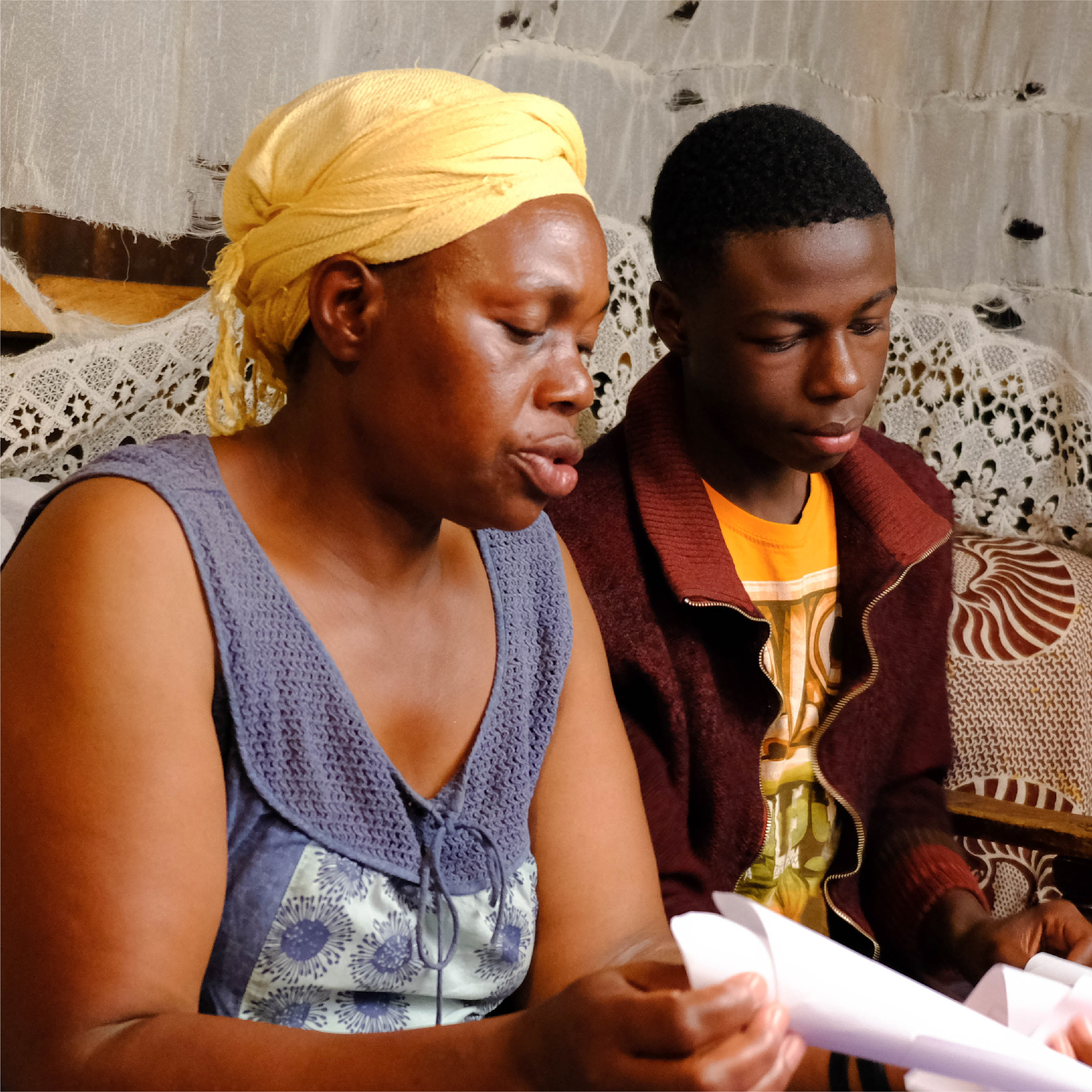
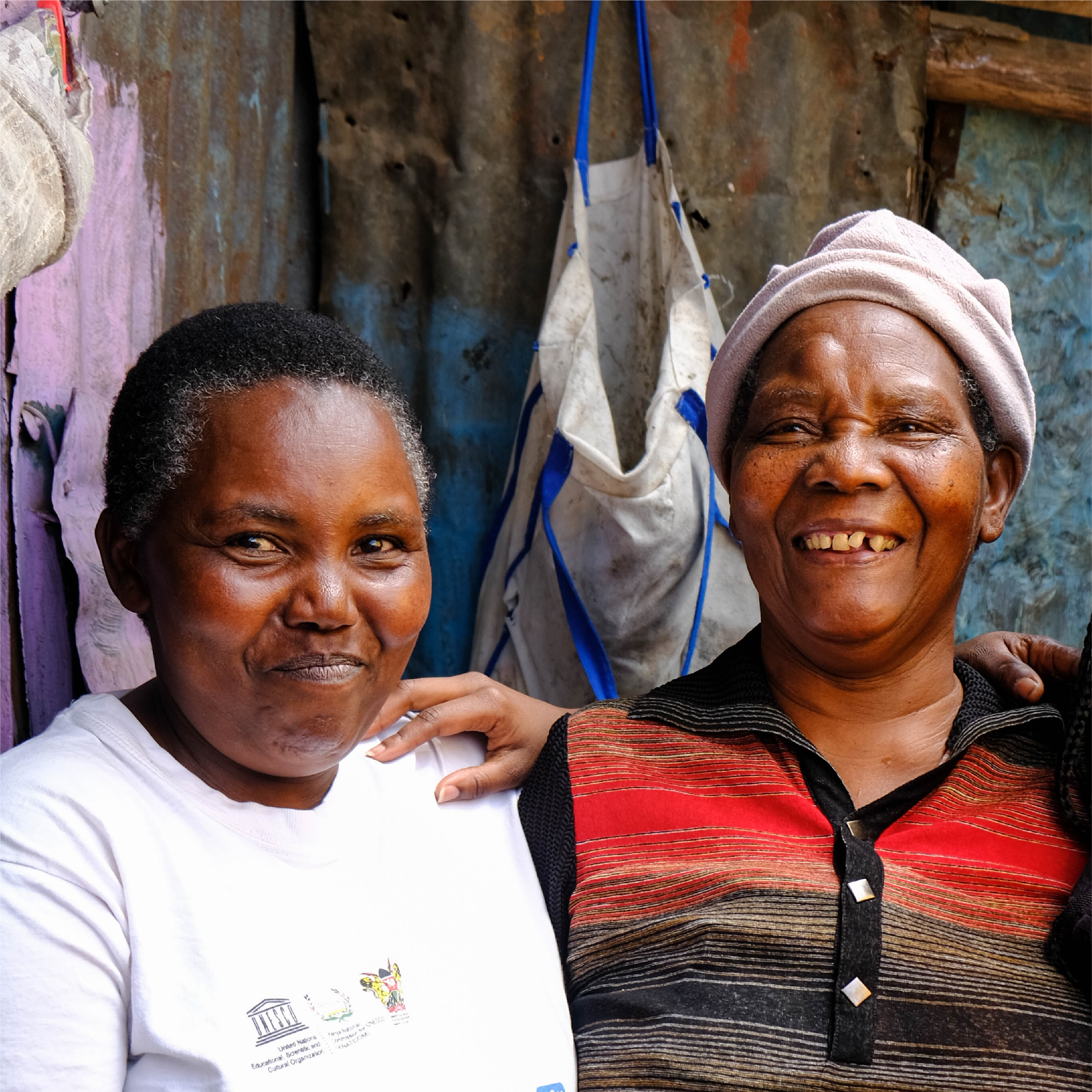
Chronicle Health was founded to place community voices at the centre of global health and development narratives — building a platform where diverse perspectives could inform, inspire and drive collaborative action. Think National Geographic meets Malala Fund, built for the global health space.
The founder needed a brand identity that could serve as an umbrella for multiple initiatives — a docu-series, editorial content, strategic partnerships — without locking the organisation into a single visual metaphor or limiting its future growth.
The challenge
Chronicle Health was building something ambitious — not just a brand, but a platform flexible enough to hold multiple initiatives under one roof. The identity needed to work across editorial content, documentary production and strategic partnerships without fragmenting or feeling inconsistent.
The brief called for warmth and credibility in equal measure — an organisation that could sit comfortably alongside institutional partners like WHO and IFC while remaining deeply human and community-centred.
The visual direction was guided by six words from the founder: authentic, inclusive, informative, captivating, strategic — and human.
Colour palette
The palette was built around deep teal as an anchor of trust and authority, warmed by muted gold, terracotta and sand. Together they create a visual language that feels grounded and human — serious enough for institutional partners, warm enough for the communities at the heart of the work.
Main Teal
#153040
Muted Gold
#B18B58
Warm Brown
#914E3B
Orange
#CD774A
Sand
#C4A084
Cream
#FCF8F2
White
#FFFFFF
Typography
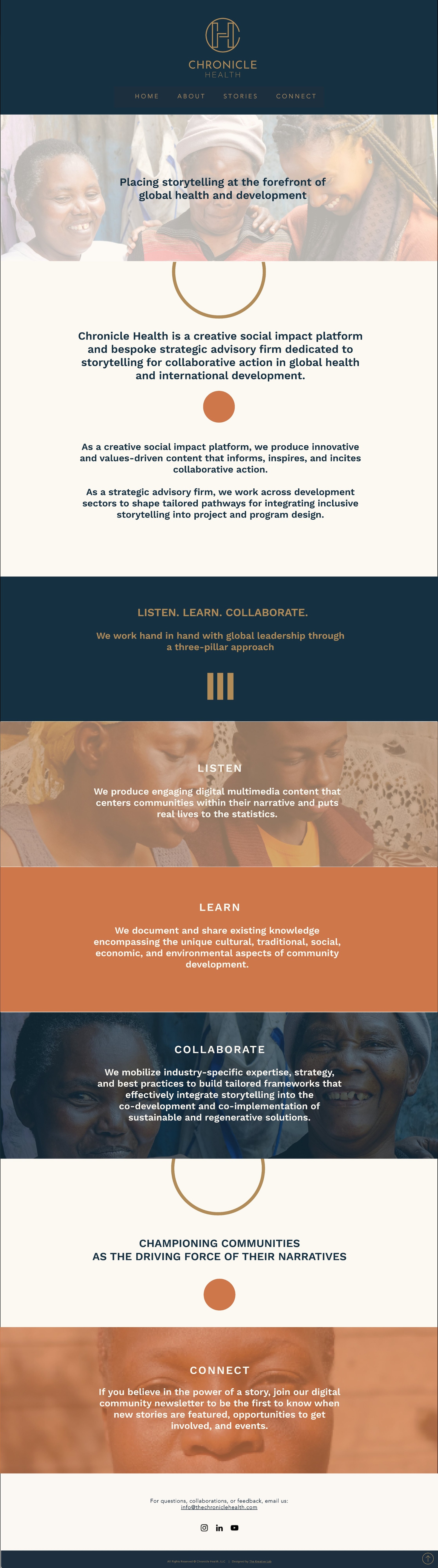
The work
The site featured parallax scroll photography sections — community photography overlaid with the brand's deep teal and warm earth tones, bringing humanity and warmth to each content block.
Primary — gold on teal
Colour option 2 — gold on cream
Start a project