01 — Identity
Logo & lockups
The wordmark pairs bold geometric letterforms with tracked capitals — confident and direct. Two primary colourways: black on white for print and digital, white on grey for coloured applications.
Brand Identity — Ethics & Entrepreneurship
Brand identity built around an ancient navigational metaphor — for an organisation helping entrepreneurs find their ethical bearing
Ethics in Entrepreneurship (EIE) was co-founded by Erika Cheung and Tyler Shultz — Theranos whistleblowers — to advance ethical practices and accountability in the startup ecosystem, helping founders, investors, and workers navigate the complex ethical terrain of building a company.
EIE came to The Kreative Lab with an existing logo and a website revamp underway. They needed a full brand system built around it — a cohesive visual system with a conceptual anchor strong enough to carry the organisation's mission. The result is a restrained, purposeful identity rooted in one of the world's oldest navigational traditions.
The brief
EIE came in with a logo that needed refinement and a brand that needed building. The conceptual brief was clear: the identity should feel like a tool — something useful, dependable, and purposeful. Ethics in business is serious terrain, but the brand couldn't afford to feel heavy or institutional. It needed to speak to founders and investors without preaching at them.
The solution came from the Stick Charts of the Marshall Islands — ancient navigational tools crafted from palm fronds, used by Marshallese sailors to read ocean swell patterns and find their way between islands. The metaphor was exact: helping entrepreneurs navigate unpredictable ethical waters using the right tools and frameworks.
The stick chart became the brand's signature graphic — the submark logo, the brand pattern, the defining visual asset of the identity. Applied consistently across all touchpoints, it gives EIE something rare in the ethics space: a visual idea with genuine depth and meaning behind it.
01 — Identity
The wordmark pairs bold geometric letterforms with tracked capitals — confident and direct. Two primary colourways: black on white for print and digital, white on grey for coloured applications.
02 — Brand mark
Inspired by the navigational stick charts of the Marshall Islands — palm frond tools used by Marshallese sailors to read ocean swells and chart courses between islands. Designed as both a standalone submark and a repeating brand pattern, applied across all collateral in three colourways.


Left: EIE stick chart brand pattern in sage. Right: A traditional Marshall Islands stick chart — palm frond ribs and shells used to map ocean swell patterns and island positions.
Colour palette
Black and white aren't just a colour choice — they're the visual language of moral clarity. Grey acknowledges what lives between them: the complexity, the ambiguity, the terrain that EIE was built to help navigate.
Black
#010101
Light Grey
#DCDDDD
White
#FFFFFF
03 — In use
Erika Cheung presenting at TEDxBerkeley — the EIE brand identity deployed as the visual backdrop for a talk on ethics and accountability in the startup world.
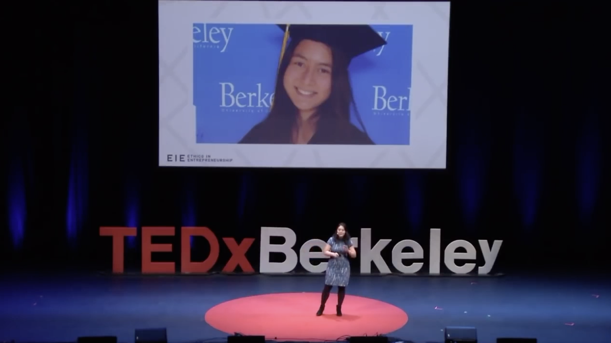
Erika Cheung presenting at TEDxBerkeley — EIE brand identity in use on stage.
Start a project